|
Here are my sources for my latest blog post about Logan Paul:
Works Cited Cook, Jesselyn. “1 Year After His Infamous 'Suicide Forest' Video, Logan Paul Is Bigger Than Ever.” HuffPost, HuffPost, 9 Jan. 2019, www.huffpost.com/entry/logan-paul-1-year-suicide-forest_n_5c2e9b92e4b05c88b70798f5. Koerber, Brian. “Logan Paul Wishes His Fans Were Older. They're Not.” Mashable, Mashable, 1 Feb. 2018, mashable.com/2018/02/01/logan-paul-young-fans-demograpphic/. Ronson, Jon. So You've Been Publicly Shamed. Picador, 2016. Paul, Logan. “Logan Paul.” YouTube, YouTube, www.youtube.com/channel/UCG8rbF3g2AMX70yOd8vqIZg.
0 Comments
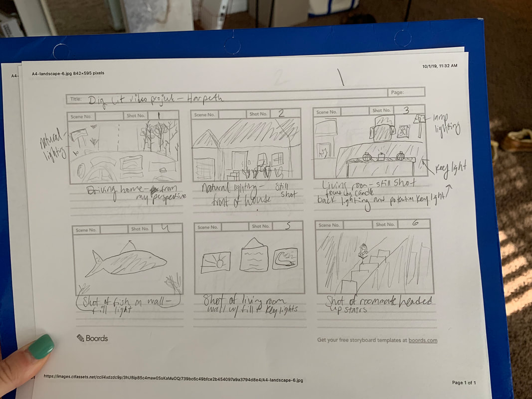
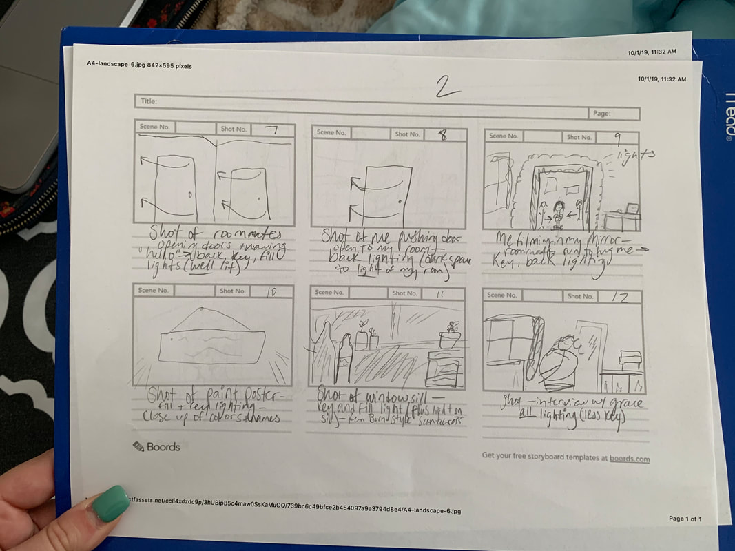
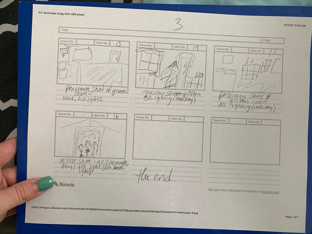
Some things should not be made public. If we haven’t learned that already from Jon Ronson’s book So You’ve Been Publicly Shamed, we may be able to learn such from famous Youtuber and influencer, Logan Paul. He describes himself in his YouTube bio as a “24-year-old kid in Hollywood making crazy daily Vlogs!” Logan got himself into a slew of trouble after vlogging in a Japanese forest where he panned the camera over to a suicide victim hanging from a tree. As stated in a HuffPost article, Logan walked up to the body with his friends laughing, saying things like “Yo, are you alive? Are you f*cking with us?” (Cook). Logan’s first vlog, appropriately titled, “MY FIRST VLOG,” was published 3 years ago. Since then, Logan has built up a following of a fairly young demographic. He is wildly recognized as an entertainer for children currently and that’s what I personally knew him (and unfortunately, still do know him) as. A Mashable article describes Logan’s interview on Good Morning America where interviewer Michael Stahan asks Logan if he “realizes the age of [his] audience,” adding that “his own kids know the vlogger,” (Koerber). Even if Logan Paul’s audience were older, the content her put out when he published that vlog was wildly inappropriate and insensitive. What upset people most about the vlog was the fact that he does have a fairly young audience demographic. Children and young adults are impressionable and without a doubt look up to Logan as a role model. The message he sends out to his audience is anything but admirable, though, even aside from this one specific instance. Scrolling through Logan’s video section of his YouTube channel, it’s clear to see that he is not catering to a young audience whatsoever. His video’s thumbnails include images of pouring alcohol into the mouth of a half-naked woman, multiple images of Logan shirtless, some of him next to barely clothed women, and even some of him sniffing undisclosed substances with his eyes rolled back in his head as if he’s doing drugs. Though Logan posted that horridly scarring video of a victim’s body hanging from a tree, he has clearly made a major comeback. He recently even fought against another Youtuber, KSI, which was a widely covered event by sites like CBS Sports, Entertainment Tonight, and the Washington Post. So, where and when did Logan comeback? Even after 750,000 people signed varying petitions to remove him from YouTube entirely, Logan posted an apology video that seemingly magically reversed his initial exile. The video, merely titled “So Sorry.” Was posted on January 8th, 2018, just a few days after his initial video’s posting. The comments on this video are mostly jokes about how weak Logan is, especially in relation to his recent fight. This YouTube horror story relates closely to the story outlined in chapter 6 of Ronson’s novel, titled “Doing Something Good.” In this chapter, Ronson tells Adria Richards’ story of a tweet she posted exposing two men sitting behind her at a work conference who made a joke about “forking repo’s in a sexual way and ‘big’ dongles” (Ronson 114). The men identified in the picture Adria posted were reprimanded, one was even immediately fired from his job (116). The similarities between Logan Paul’s video and Adria Richard’s tweet exposing the men lie in the fact that these jokes and comments could have gone undetected had nobody published them. The fact that the men were exposed in both platforms is what led to their downfall. My hope for the world is that people think very carefully about what they post in such a public and exposed world. We must learn from the people who embarrass themselves by acting insensitively on a public platform and we must be better than how these people have acted. 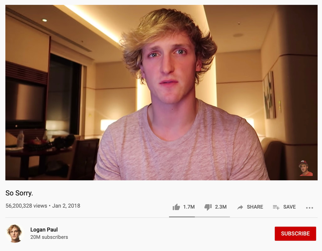 For our second blog post, our class was to create a sample archive home page for our archive of "The Tempest" as performed by the Nashville Shakespeare Foundation this Fall of 2019. I struggled greatly with the actual creation of this image. Creating the "logo" (it really isn't much of a logo) proved incredibly difficult to me just because of the nit-pickiness of Adobe Photoshop and my unsteady hands. Placing this logo into my document on InDesign by Adobe was even more difficult. This all being said, I know that the image I have created as a sample homepage is not the best I could have made. However, considering this is my first time working independently with Photoshop and InDesign, I am fairly proud of the coherence of my page. I didn’t want drastic contrast on my homepage as I wanted to appeal to a classic, more traditionalist audience. Shakespeare is very much a classic playwright and I wanted my page to reflect his work. I kept the page a calming blue which contrasts the entire concept of shipwreck that drives the play. I also highlighted the shipwreck in my logo as my logo is an image of shipwreck by Willem Van De Velde (II) (http://www.rijksmuseum.nl/collectie/zoeken/asset.jsp?id=SK-A-1848). I aligned the navigation bar directly below the title of the homepage so that it was easy to find when first entering the page. I wanted the purpose and functions of the page to be clear, so by placing the different navigation options front and center, the page is that much more accessible and convenient. I made the title of the page white while the navigation bar options are black so that those two did contrast with one another. If I were to change anything, I would consider altering the color of the introductory text I placed next to the photo on my home screen (courtesy of Dr. Yeo’s class). Doing this would separate that text from the navigation bar, making the navigation bar itself stand out more. 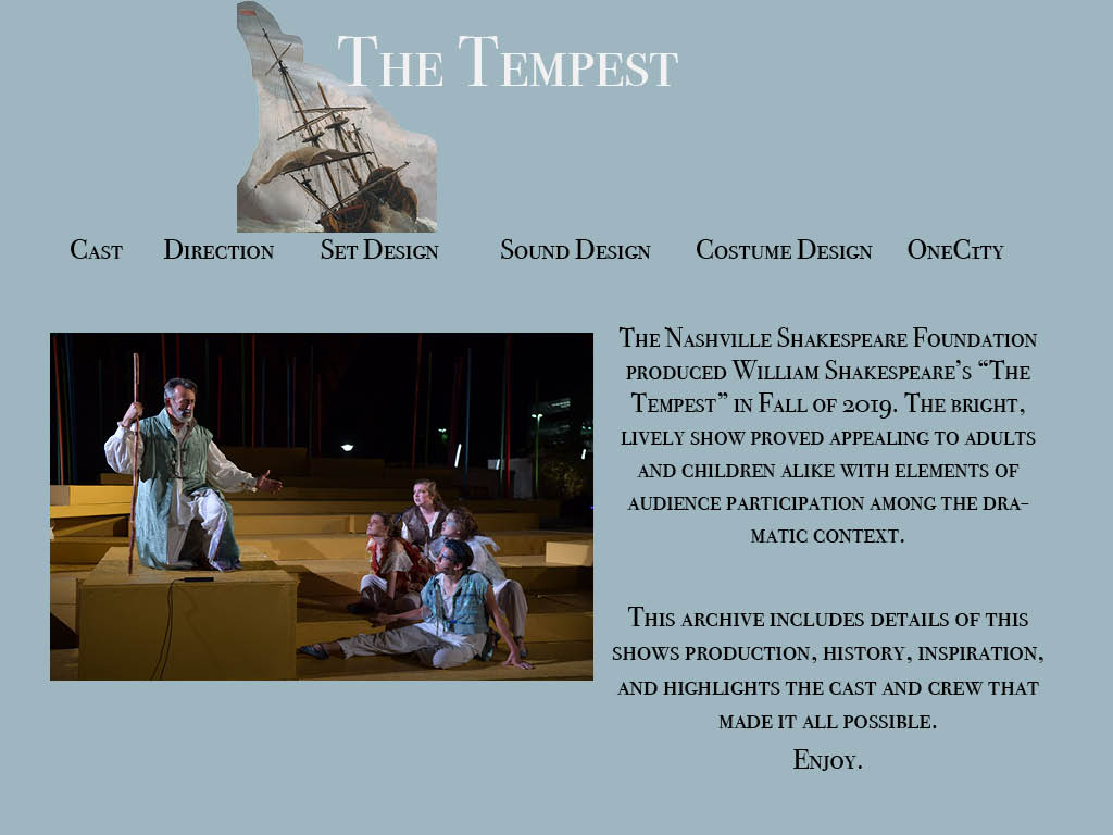 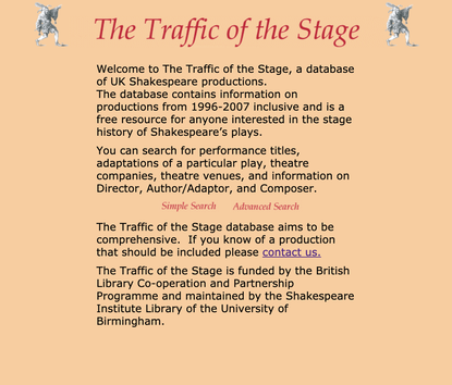 The “Traffic of the Stage” Shakespeare performance achieve comes from the University of Birmingham. This self-proclaimed “database of UK Shakespeare productions” provides a brief introduction to the page and provides just three simple options for users to click-on: one titled “Simple Search,” one called “Advanced Search,” and a “contact us” option.
This site is providing the information its assumed audience of readers would want. The brief description reports that productions from 1996-2007 are included in the database. The site’s author(s) specifically mention how this page appeals to “anyone interested in the stage history of Shakespeare’s plays.” The audience for this site is clear and deliberate. This is most definitely not a site a random internet-surfer would just happen upon. The next paragraph on the home page provides a concise description of what may be searched through the pages two options for searches (“simple” and “advanced”). These search options allow for viewers to use any bit of information they have on a production to potentially find the exact show they’re looking for. This page is extremely easy to navigate. The fact that it only provides three clickable options on its home page allows for quick answers right away; there are no distracting images, videos, or advertisements to get in a viewer’s way. Even those who are not as familiar with technology would potentially be able to use this site with ease and receive satisfactory results. The simplicity and clarity of the site are most definitely appealing factors that should be considered by our Digital Literacies class when creating our own Shakespeare Archive. While this page is incredibly easy to navigate, it is anything but attractive or aesthetic. The entire page is a dusty orange color. The text is centered in black font underneath the title, “The Traffic of the Stage” in an italicized, red font. The search options mirror that font of the title in a smaller size. The search options also occur directly in the middle of the page’s introductory text, proving to be distracting and confusing. The placement of the search options makes it seem as if the site’s author(s) did not necessarily want people to “contact” them if their audience does “know of a production that should be included.” The only images available on this page are two grey, jester-like figures on either side of the page’s title. However, because these figures are so small, it is difficult to tell exactly what they are at first glance. I actually had to zoom-in on them quite far in order to really determine what they could be. Much like the placement of the search options, these figures are distracting and confusing. They detract from the purpose of the page and, in a way, reiterate how many people already view Shakespearian productions today: they are seen as confusing, intangible, and absurdly difficult to read and/or translate. While our class can easily learn something from the simple nature of “The Traffic of the Stage,” there are definitely plenty of additional factors that should be presented in our archive that aren’t on this site. Great archives provide clear images and video options directly on the homepage. The text of the archive should only provide worthwhile and clear information and should not be split by clickable links. The links to other pages on the site should be in a menu format so that they are identifiable and constantly accessible. I have no doubt that our class will be able to appropriately serve all populations of learners through our archive while making it creative and exciting at the same time. |